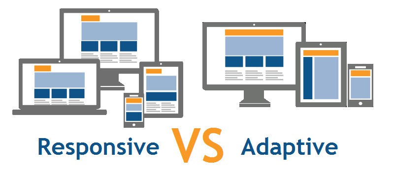
Responsive Design vs. Adaptive Design, Which One Is Better?
If you’re redesigning a website, you’ve probably heard two terms keep coming up: responsive design and adaptive design. One is to deliver great experiences across devices, but they take different technical routes, and they produce different trade-offs for UX, performance, SEO, and maintenance.
Quick answer up front
- Choose responsive design if you want a single codebase, consistent content across devices, easier maintenance, and excellent SEO compatibility.
- Choose adaptive design when you must deliver highly optimized, device-specific experiences, for example, for large e-commerce catalogs, enterprise portals, or performance-sensitive applications where different layouts significantly change behavior.
The “best” choice depends on your users, business goals, and technical capacity.
Responsive Design
Responsive design uses fluid grids, flexible images, and CSS media queries to adapt the same HTML content to different screen sizes. The browser recalculates layout rules as the viewport changes, so the site “responds” smoothly to any device, from a narrow phone to a wide desktop monitor.
Key characteristics:
- Single HTML/CSS codebase (and often a single JavaScript bundle).
- Layout adapts continuously (fluid or breakpoint-driven
- Widely supported across frameworks and CMS platforms.
Why teams like responsive:
- It simplifies maintenance, one set of templates powers all devices.
- It keeps content parity, users see the same content regardless of device.
- It aligns with search engine expectations and indexing (Google favors mobile-friendly, responsive sites).
Typical tools/patterns: CSS Grid, Flexbox, media queries (@media), responsive images (srcset/sizes), and utility frameworks (Bootstrap, Tailwind).
Adaptive Design
Adaptive design serves different fixed layouts for different device classes. The server or client detects the device or viewport category (mobile, tablet, desktop, large desktop) and returns a layout specifically designed for that category.
Key characteristics:
- Multiple templates or versions for defined breakpoints (commonly 3–6).
- The server or client decides which layout to deliver.
- Device-specific HTML and assets, optimizing for context and capabilities.
Why teams choose adaptive:
- It allows tight control over layout and performance per device class.
- You can reduce payload on mobile by sending lighter HTML/CSS/JS.
- It supports complex experiences where desktop and mobile use cases differ dramatically (e.g., complex dashboards vs. simple mobile tasks).
Typical techniques: server-side device detection, client-side JavaScript detection for feature support, and separate templates per breakpoint.
Direct comparison: UX, Performance, SEO, and Maintenance
User Experience (UX)
- Responsive: Delivers a consistent experience across devices. Users can resize windows and keep the content flow. Designers must prioritize content hierarchy so interfaces work at every width.
- Adaptive: Lets you craft device-specific UX. You can simplify navigation on phones and add richer control panels on desktops. That can improve task performance if you target common device behaviors.
When UX favors adaptive: when mobile and desktop journeys are fundamentally different (e.g., a retail manager’s backend vs. a customer checkout).
When UX favors responsive: when content parity and consistent branding matter most (blogs, corporate sites, marketing sites).
Performance
- Responsive: Often loads the same base HTML and scripts, then adapts. If optimized, this can mean unnecessary payload for mobile users. But modern responsive sites use progressive enhancement, srcset, and code splitting to mitigate this.
- Adaptive: You can send lighter assets to mobile and heavier assets to desktop, which can significantly improve performance on constrained devices and networks.
Performance tip: responsive + careful asset optimization (responsive images, lazy loading, critical CSS) often hits the sweet spot for most businesses. Use adaptive only when payload savings from sending different HTML matter significantly.
SEO
- Responsive: Favored by search engines because a single URL serves the same content and is easier to crawl and index. Google recommends responsive design for mobile-friendly indexing.
- Adaptive: Works with SEO, but you must ensure content parity and use correct canonical tags and rel=”alternate” where necessary to avoid duplicate content issues.
SEO rule of thumb: choose responsive if SEO and content discovery are primary goals.
Maintenance, Development & Cost
- Responsive: One codebase lowers development and maintenance costs. Designers and developers iterate quickly.
- Adaptive: Multiple templates increase design, QA, and infrastructure complexity. Adaptive projects cost more upfront and take longer to test.
Business decision: Responsive reduces long-term maintenance burden for most organizations. Adaptive fits when you can justify the extra investment with measurable benefits.
Common use cases: when to pick one over the other
Pick Responsive if:
- You run a content site, blog, marketing site, or small/medium e-commerce store.
- You want a faster time to market and easier updates.
- You need one codebase for easier CI/CD and developer workflows.
- SEO performance and content parity matter.
Pick Adaptive if:
- You operate a complex product where mobile and desktop tasks differ widely (e.g., SaaS analytics dashboards vs mobile field apps).
- You must squeeze every millisecond of load time for mobile users and can improve conversion by sending targeted HTML.
- Your engineering team can support multiple templates and extensive QA.
Hybrid approaches: best of both worlds
You don’t have to pick a pure model. Many teams use a hybrid architecture:
- Use a responsive layout for most templates, but serve optimized assets conditionally (adaptive asset loading).
- Implement server-side rendering (SSR) with responsive HTML and adaptive image/JS delivery based on user agent or client hints (e.g., Save-Data, Client Hints).
- Progressive enhancement: build a responsive site that progressively enhances for capable devices (feature detection) and offloads heavy features only where supported.
Accessibility and inclusive design
Both approaches can be accessible ,but you must design for it intentionally.
- Ensure keyboard navigation, screen-reader semantics, and readable content (font sizes, contrast) across breakpoints.
- Avoid hiding essential content behind device-specific templates unless you offer an accessible alternative.
- Test with assistive tech on real devices and with different viewport sizes.
Accessible design tends to favor responsive approaches because content parity ensures screen readers and assistive devices encounter the same content structure.
Implementation considerations and modern tooling
Tools and patterns that make responsive and adaptive implementations better and faster:
- CSS Grid & Flexbox, build robust, fluid layouts for responsive designs.
- Picture, srcset, sizes, responsive images to serve appropriate resolution images per viewport.
- Client Hints and Save-Data, adaptive servers can honor user preferences and network conditions.
- Service Workers & caching, critical for mobile UX (offline, fast repeat loads).
- HTTP/2 & CDN, reduce latency for all asset types; helps both responsive and adaptive.
- Server-Side Rendering (SSR), improves perceived performance and SEO.
- Design systems and pattern libraries, standardize components across templates and breakpoints.
Testing: How to validate your approach?
Test across these dimensions:
- Performance: Lighthouse metrics (LCP, FID, CLS), Webpage Test, and real-user monitoring (RUM) for real networks.
- UX: Usability testing on common tasks (search, checkout, contact form) for desktop and mobile.
- SEO: Crawl with tools to ensure indexing parity and check mobile usability reports in Google Search Console.
- Accessibility: Automated scans (Axe, Lighthouse) and manual testing with screen readers and keyboard navigation.
- Device coverage: Test on low-end Android phones, iOS devices, tablets, and various desktop screen sizes, don’t rely on simulators only.
Measure user success on key flows and iterate.
Real-world examples
- Responsive success: A local business or marketing site uses responsive design with image optimization and local caching; they cut bounce rates and improved organic traffic because content remained identical across devices, and performance improved.
- Adaptive success: A large retail site served a slim, image-light mobile landing page and a richer desktop shopping experience; mobile conversion rose because pages loaded faster and the shopping path reduced friction.
Both approaches work, and only the difference lies in the data and context, who your users are and how they behave.
Decision checklist for your team
Answer these to choose:
- Who are your primary users? Mobile-centric shoppers, desktop power users, or both?
- Do mobile and desktop require fundamentally different features?
- What’s your development and QA budget?
- Do you need to minimize payload for mobile on slow networks?
- Can your team maintain multiple templates, or do you need one codebase?
- Do you have analytics to validate prototype performance after launch?
If most answers point to content parity, limited budget, and SEO focus → responsive. If you need device-tailored journeys, extreme performance tuning on mobile, or separate feature sets → adaptive or hybrid.
Migration and redesign tips
If you already have a desktop-first site and plan to modernize:
- Audit mobile traffic and user behavior to prioritize pages.
- Start with a mobile UX audit: measure performance, core user tasks, and bottlenecks.
- Prototype mobile wireframes first (mobile-first mentality).
- Use a component-based design system to keep UI consistent.
- Implement responsive images and critical CSS to reduce first paint time.
- Consider adaptive asset loading for heavy third-party scripts (analytics, chat, A/B tools) to reduce mobile impact.
Final thoughts
Responsive design dominates because it balances maintainability, SEO, and consistent UX for most projects. Adaptive design shines when your user journeys diverge strongly between devices or when delivering the lightest possible mobile experience matters to conversions.
The best teams stop arguing about ideology and start measuring outcomes.
Ready to decide on your site?
If you want help choosing the ideal approach for your business ,and implementing it with performance, accessibility, and SEO in mind, Houston Texas Website Design can audit your current site, run a mobile UX study, and recommend a responsive, adaptive, or hybrid roadmap tailored to your visitors.
Schedule a free consultation at HoustonTexasWebsiteDesign.com and let’s plan the best path for your users.